


Companies like Netflix, Airbnb, and Spotify use psychology-led design to win consumers over. Ultimately, great design is about understanding people and their pain points. Product designers have taken advantage of this for decades to build successful products.
Reciprocity is a social norm of responding to a positive action with another positive action. It’s why you feel indebted when someone does you a favor.
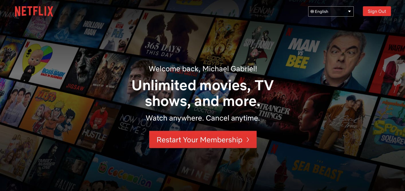
Netflix asked their customer base, “ What one thing would you like to know more about before signing up for Netflix?” The most popular answer (46% of responses) was “knowing all of the movies and TV shows available.”
Netflix designed its experiment by using an image that hinted at an extensive catalog.
Giving people a sneak peek — but not the total view — made customers more likely to sign up for a free streaming trial.
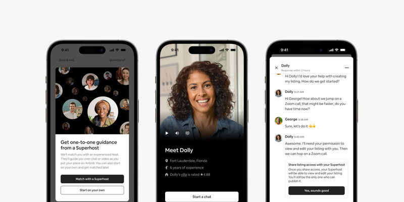
Airbnb uses the reciprocity principle by educating hosts on how to treat their guests well, and guests to follow the house rules.
More reciprocity leads to:
Higher ratings > Higher ratings > Higher demand.
Higher demand allows hosts to charge more and thus make more money not only for themselves but for Airbnb too.
The Cocktail Party Effect states that people like to focus on information that’s relevant to them. It also proves that if we go deeper, relevant content can drive incredible results.
Netflix describes itself as “user-obsessed” and strives to deliver a totally personalized experience.
Their “Because you watched…” category is a prime example of this philosophy in action as more than 80% of Netflix shows customers watched in the last two years have been a direct result of Netflix’s recommendation engine.
Personalization is a MOAT in product & design.

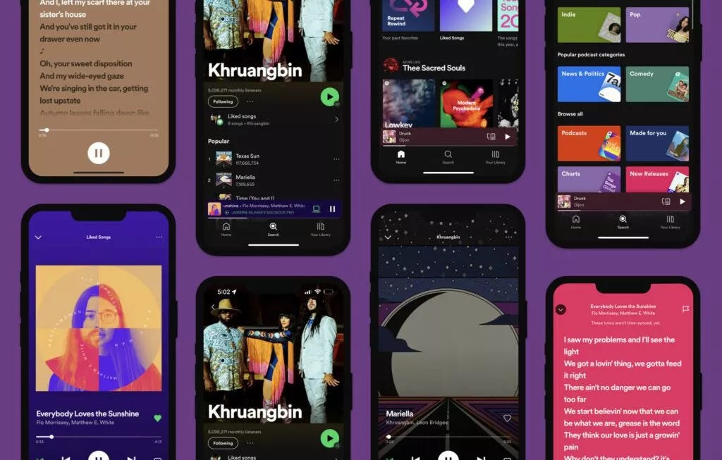
Spotify Wrapped is a prime example of personalization done right.
It’s not throwing around data and metrics just for the heck of it. Instead, it keeps the spotlight on the users themselves and focuses on the parts of Spotify’s UX that users value.
With Wrapped, Spotify is subtly reminding us of the specific ways:
Recent studies into psychology, happiness and customer experience have uncovered a principle called “Idleness Aversion.” It states that people are happier when they are busier, even if they’re forced to be busy.
.jpg)
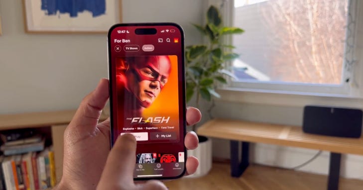
Netflix applies Idleness Aversion in an interesting way. Their experience forces you to watch trailers that auto-play when you dwell on the title.
This feature is a source of frustration for many customers, but the benefits of Idleness Aversion have clearly outweighed the costs for Netflix.

Since 2020, Wrapped has achieved a whole new level of gamification by adding literal games. All of these features are packaged in a way that is best suited to demonstrate your music engagement.
By showing listeners how they stack up compared to others — for example, by awarding “top 1%” status to the biggest listeners of a particular artist — they create a sense of:
Although this has led some users to be more confused than pleased (Just like Netflix), but the popularity outweighs the confusion here as well.
Designing for visceral reactions is essentially designing to create a positive aesthetic impression. It takes just knowing what looks pleasing to people and what doesn't.
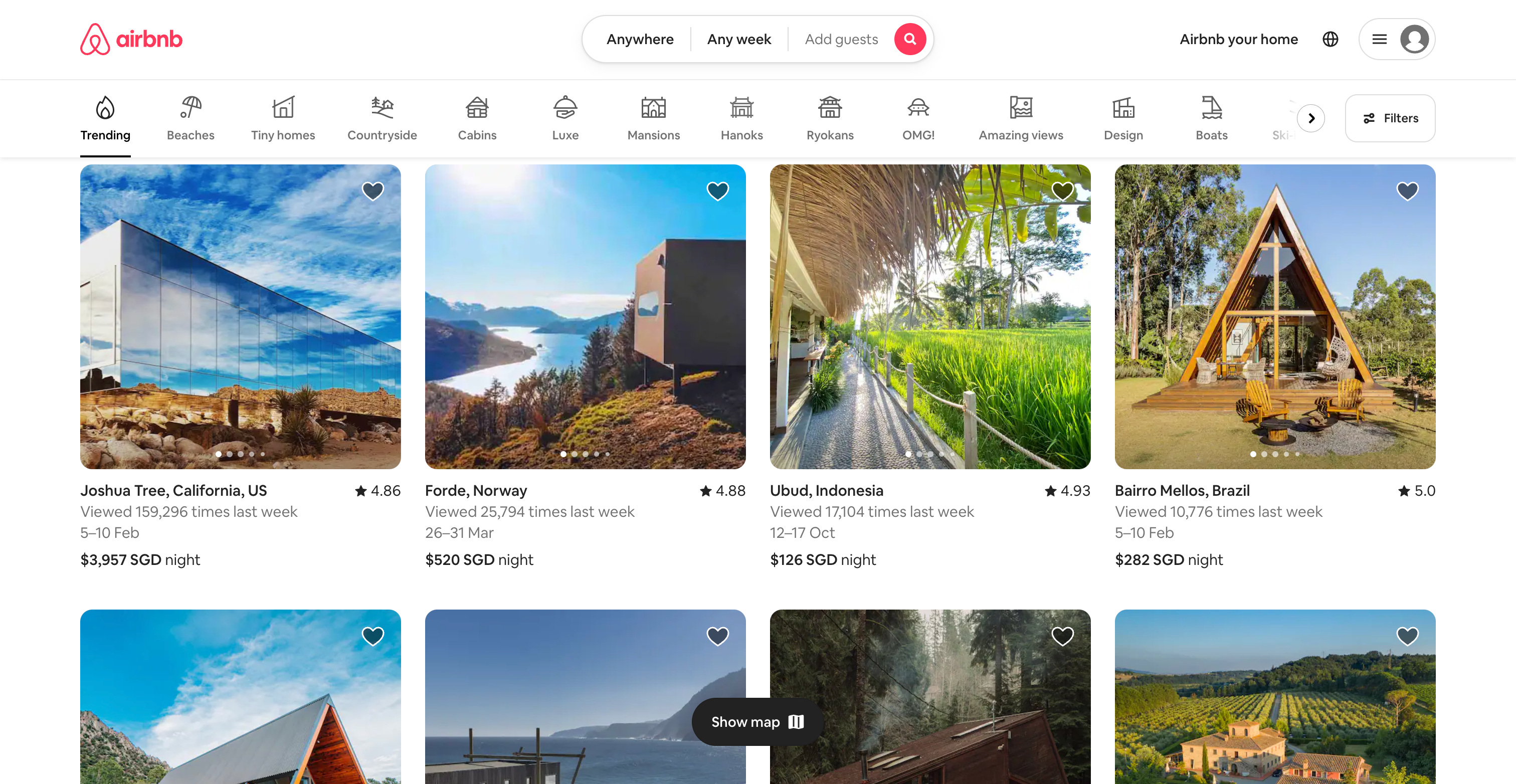
Airbnb uses visceral designs to capture the beauty and exotic aesthetic of travel. Although most Airbnb’s for rental probably don’t have beachside views or colorful accommodations, Airbnb uses design to connect their audience with the excitement and possibility of traveling the world.
Spotify utilizes visceral design principles throughout their product to delight users, like their custom mixes based on a user’s recently listened-to tracks. The screens play with minimal text and iconography and let the artists, albums, and lyrics speak for themselves.
They have also made it quite immersive, with video backgrounds and lyrics for certain songs.
If you want a user to remember something, make it stand out. Also known as "The Isolation Effect", it states that users are more likely to remember an object if it is visually different.

Netflix uses the Von Restorff Effect when onboarding new users. When a person lands on the Netflix’s homepage, they see the above screenshot. After reading the text, that unique red button is the only element that’s standing out and tempting you to press it. Netflix also used this effect to highlight “New Episodes” with the red tag.
Spotify is a bit subtler with its premium pricing. Instead of making the premium option a different color or shape, they bold the text.

This solution works well because the users will walk away remembering the extra benefits of premium instead of the icon alone. But remember: the Von Restorff effect says things that stand out are more memorable. That rule doesn’t just apply to UI elements. It applies to your entire app.
As defined by the Interactive Design Foundation (IDF), “The time to acquire a target is a function of the distance to and size of the target. As the distance increases, movement takes longer and as the size decreases selection again takes longer.”
Spotify has placed a CTA right at the focal point which makes it easy for people to take quick action. Spotify makes the button easy to reach, many Spotify buttons can be accessible using one hand. Placing call to action buttons within the top menu can help site visitors take quick action at any point of time.

A combination of successful implementations of both Fitts’s law and cards is what makes the Netflix UI so addictive and powerful.
.webp)
The unique Netflix experience starts with the above itself with a clean red CTA button conveying the message — which is essentially a small card. And this card experience continues onto the profile selection screen as well. Do note the size of the profile cards here. They’re not so small as to make you forget the function of the screen nor are they big enough for you to find it imposing. It’s just the right size. As Fitts’s Law says, beyond a point, a size increase will not be making a significant difference.

They literally just use cards as a loading screen. Eventually the grey rectangles get filled up with thumbnails. This is such an innovative loading idea. It doesn’t take up any additional loading screen or uses a different design element and works as a brilliant pointer to let us know where to keep our eyes fixed.
Understanding human perception is vital for every designer. Know more about design psychology by booking a session with our mentors today.


.png)

.png)
![The Definitive Guide To A Creative Website Design [2023]](https://cdn.prod.website-files.com/60f120767a8f0187072655dc/64bdfda95d10b365e8f1dcfa_ADPList%20-%20Creative%20Websites.png)


