


From Spotify to Airbnb to Google, world’s hottest product companies have one thing in common when it comes to design - Brilliant Design Systems. Learn how you can use the existing design systems to create better user experiences and interfaces. Moreover, using a design system can also enhance a designer’s productivity, inspiration and efficacy.
Let’s find how you can use them to advance your UI/UX and product design to a whole new level! 🔥
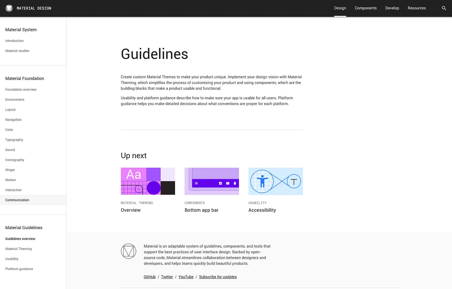
The purpose of Material Design is to support designers and developers to build responsive, usable and scalable apps – and to do so quickly.
Solve usability issues effectively: It is a trustworthy and consistent package of detailed guidance for digital product UI designers. You don’t need to invent everything from scratch with such a detailed set of tried & tested guidelines.
Google Material Design System
Build responsive designs: Since Material Design was built on a mobile-first sensibility, it also promotes animation in designs, both for user feedback and to hint at how different features function, helping designers to make every design & product responsive.
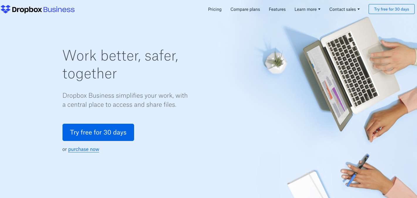
Dropbox Business can be a typical example that adopts the Material Design concept since early times. The website uses one single color palette with black and white included as background.
More granular advantages for Material Design include subtle skeuomorphism, which sets it apart from flat design and makes it more intuitive for many users. Another user-friendly feature is that user feedback in the form of haptic feedback, subtle animations, and similar things are built into the guidelines.
Check out the Google Material Design System here.
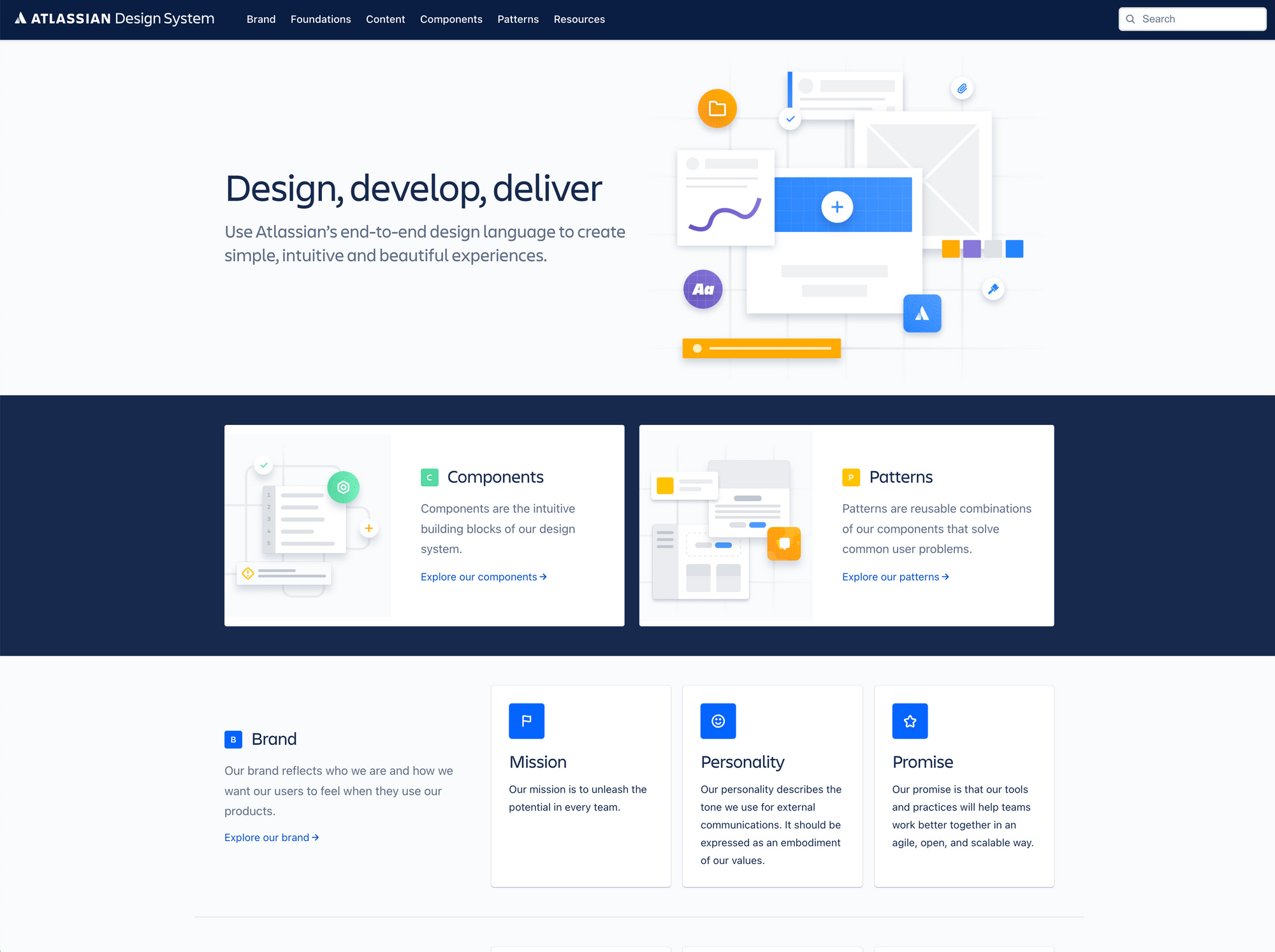
Use Atlassian's end-to-end design language to create simple, intuitive and beautiful experiences. Atlassian design system has plenty of design resources like tools, plugins, and UI kits that you can leverage to create better and scalable designs.
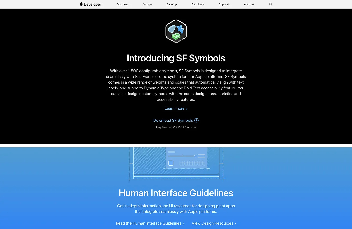
Apple Human Interface Guidelines (HIG) aim to help you design delightful user experiences.
“I’ve been developing an IOS app for the past few months and have been constantly referring to Apple’s Human Interface Design Guidelines. I would consider it a must-read for any aspiring or current UI/UX designer.” - Senior Product Designer @Dannysapio.com
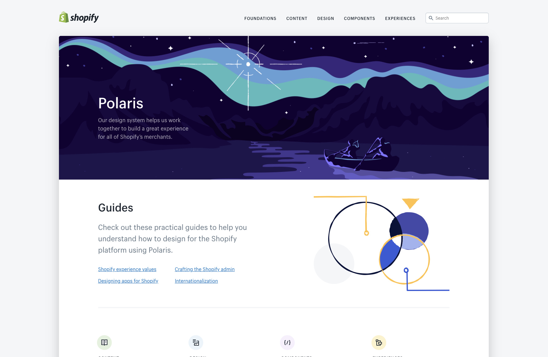
Using Polaris, you can solve some common UI challenges & get inspiration for how to use language, content in design, visual elements and UI components to craft better product experiences for any e-commerce related project.
Fluent is an open-source, cross-platform design system give designers and developers a solid foundation to create intuitive, accessible, and powerful experiences using the latest tried and true user interface patterns. It takes some guesswork out of the equation when building a new solution. Designers can rest easy knowing they use proven components and patterns throughout their work. This can give our solutions a polished feel that customers expect.

1. It removes some risks helps project managers close the gap in delivery and save loads of time and effort.
2. Established best practices give designers, developers, and upper management a set of standards that can help remove some guesswork when approaching complex solutions.
3. Anyone building inside the Microsoft ecosystem can take advantage of this shared language. Accessible best practices, standard components, controls, and designated style classifications with proven, user-friendly patterns.
4. The Microsoft Fluent Design System mitigates duplicative work — like repeatedly creating the same elements and concepts — so your team can move more quickly. You can design complex solutions at scale while building better products for your customers.
You can learn more about building awesome products or designs. Book a 1:1 session with our expert Mentors.


.png)

.png)
![The Definitive Guide To A Creative Website Design [2023]](https://cdn.prod.website-files.com/60f120767a8f0187072655dc/64bdfda95d10b365e8f1dcfa_ADPList%20-%20Creative%20Websites.png)


